Concept
Artists through the ages have explored the concept of a self portrait using a medium of their choice, from painting to photography. Today, we find ourselves in the information age where one can login into a social network, which are also massive knowledge banks, and find out what one 'likes'. Previous research in the field of psychology has indicated that the data one accumulates in such a way may be used to describe personality traits of oneself.
Keeping this in mind, I chose to visualize my taste in music and movie using data I obtained from my profile on Facebook. I found this concept interesting for two reasons:
1) The visualization would serve as a self portrait to individuals other than me, in which information, derived from data, is represented by abstract shapes as opposed to the traditional forms of self portraits where information is embedded the form of an image (such as a painting or photograph of oneself)
2) The visualization would serve as a pensive for myself: a creation to introspect about things I like and why I like them

Implementation
The Platform
The platform chosen for this project was the CAVE2 Virtual reality system present at the Electronic Visualization Laboratory at UIC. CAVE2 is approximately 24 feet in diameter and 8 feet tall, and consists of 72 near-seamless passive stereo off-axis-optimized 3D LCD panels, a 36-node high-performance computer cluster, a 20-speaker surround audio system and a 10-camera optical tracking system. The design of the visualization, which is discussed below, leverages the circular nature of the CAVE to surrounding and immersing the user with data, strengthening the argument for the visualization as a pensive where one is surrounded by things that pertain to oneself.
Data sources
All data for the purpose of this project was acquired by querying the Facebook graph API on a personal account. If the User has linked his/her Spotify account with his/her Facebook account, the user can query the Graph API for data pertaining to each song that the User listens to. Data derived from such queries can provide meta such as Title of the Song, Artist Name, Album Name, Genre, Timestamp etc. The graph API can also return a list of movies that a User has indicated to have watched as well as the User's ratings for those movies if it be the case that the user has rated them. The ratings for these movies can be a number from 1 to 5.
Data extraction
A python script was written to query the graph API to get the data described above. For songs, the script gets the song ids of all songs which are returned by the Facebook API. These song ids can be queried in batches of 50, to get respective album and artist names which are saved to a list along with the title and plays. For movies, the script queries the graph API and receives movie ids associated with each movie that the user has watched along with their rating for the movie. The movie ids are then queried in batches of 50, to check whether they contain metadeta about the director of the movie. Some movie ids do not return such metadata as they do not have an official 'page' on facebook are instead 'community pages'. In the case that the graph API does not return any meta about the director of the movie, the movie's title is saved to a list that queries an API called IMDbPY, which can return metadata about a movie based on its title.
Design
Form
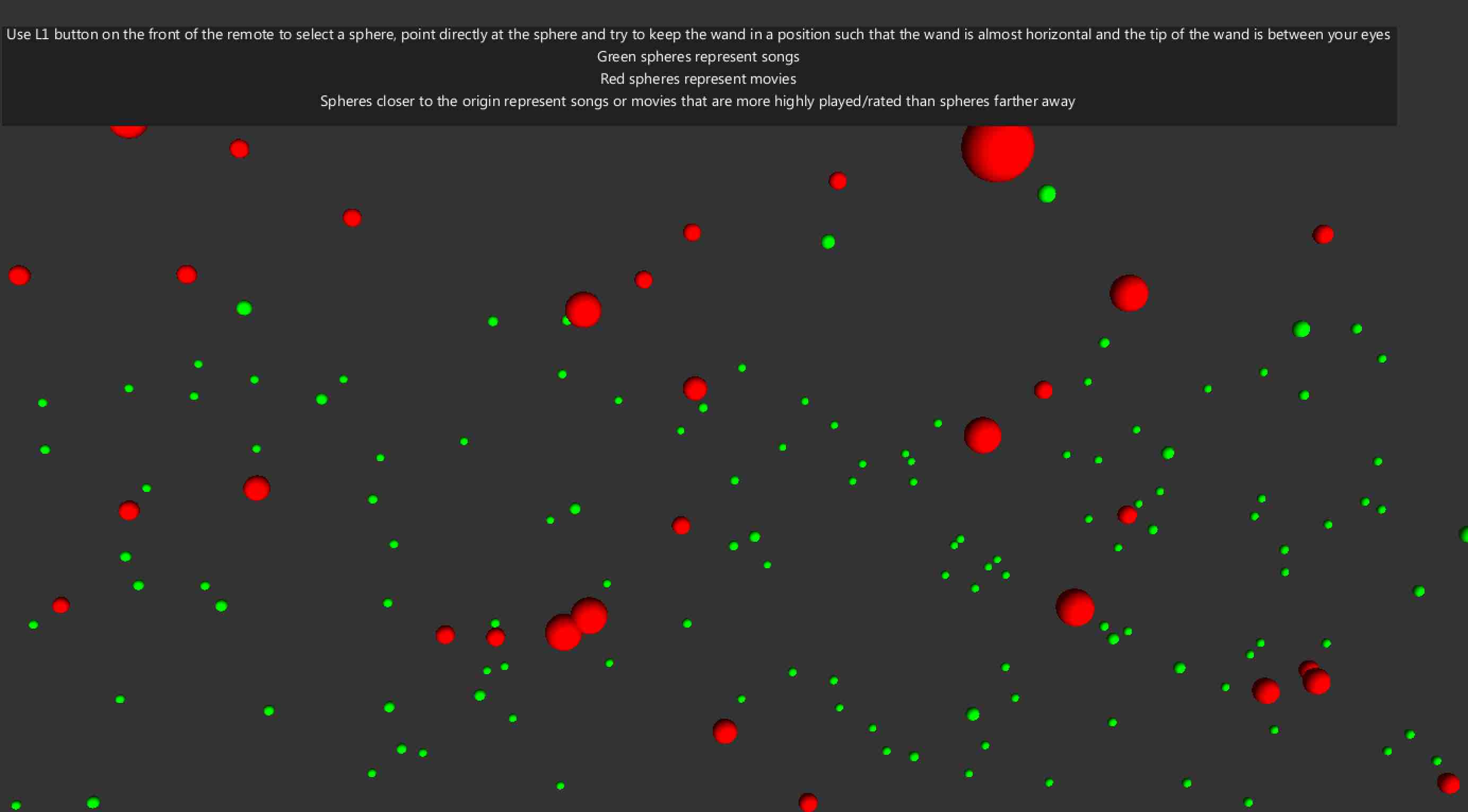
I chose to represent the data as spheres in 3-Dimensional space where the user would be at the origin. The spatial organization of the data is such that the closer the sphere is to the user, the more highly it is rated by the user(In the case of a movie) or the higher number of plays it has(based on its Spotify listening history). The colors assigned to the spheres represent their type: red spheres represent movies while green spheres represent songs. A HUD greets the user upon starting the visualization, and presents some basic information about the visualization such as the above.
Aesthetic considerations
Due to this how spheres are laid out in space, as discussed above, they tend to form concentric rings around the user who is at the origin. The process also implements a version of the best-candidate algorithm described here, which ensures that spheres are laid out uniformly in space, without clustering, in a way that is aesthetically pleasing to the eye and makes full use of the 360 degree immersion of the cave.
Interaction
All interactions with the project are undertaken with the help of the wand, which is the primary interaction device of the CAVE2. Upon selection of a sphere, which is triggered by the L2 button of a wand which is pointed at the sphere, the color of the sphere changes to yellow to signify selection. Selection also forces a change of the HUD to display information relevant to the sphere. If the sphere represents a movie, the HUD reflects the title of the movie, the director of the movie and the rating assigned to it by the user who owns the data. If the sphere represents a song, the HUD reflects the title of the song, the artist of the song, the album it appears on and the the number of times the user who owns the data has played the song.

Search
A search feature has been integrated into the visualization, which gives the user a chance to discover key insights about the data presented to them. The user can use the search feature to locate a specific album, artist, director or movies and songs below/above a certain threshold such as only displaying movies with the rating of 5(out of 5) or songs that have atleast 10 plays within the dataset.
All of the above search queries can utilize one of the two search methods:
1) Search by visibility: Only displays the spheres that have been selected by the search query, hiding the spheres that do not fit the criteria. This type of query is ideal when one wants to locate a certain criteria of spheres quickly. The original color of spheres is retained(Red for movies and green for spheres)
2) Search by color: Changes the color of the spheres that have been selected by the search query to Orange while all the other spheres in the visualization turn to blue. This type of query is ideal when wants to compare a certain criteria of spheres in relation to the spheres around it(such as distance). All the spheres are visible for this type of a query.

Reset
A reset button has been provided in the main menu in case the user wants to reset changes that may have been triggered by the search function. The reset button resets the color of the spheres to their original positions and ensures that all spheres are visible. It also resets the position of the user to the origin, which is where the visualization starts from the users perspective.